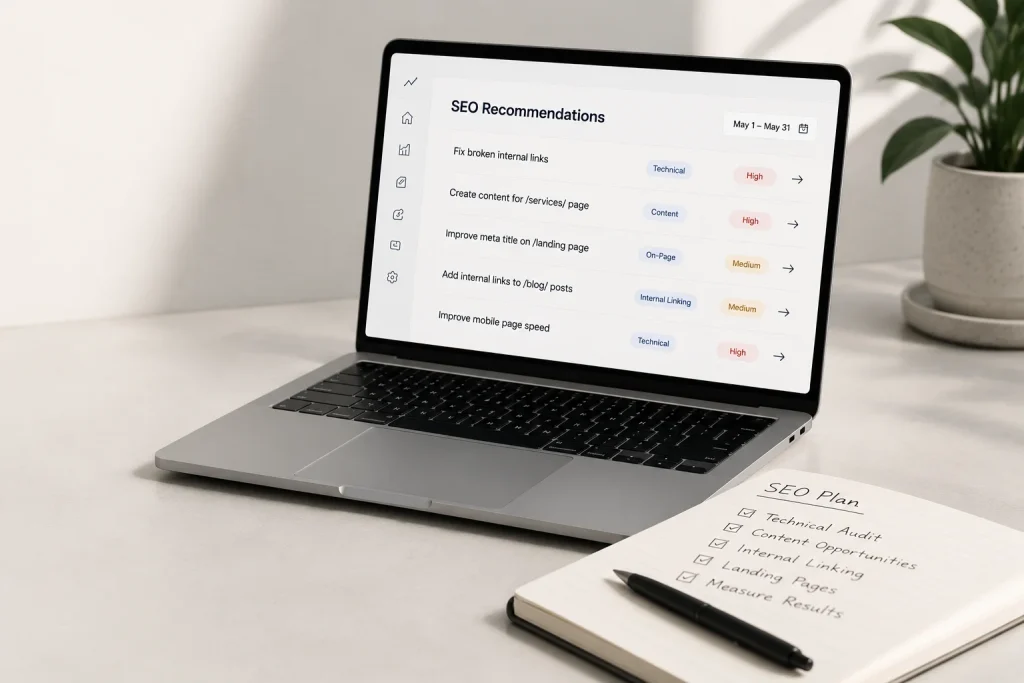






Every medical practice website needs six things to work properly: clear service and provider information, an obvious way to book or contact the practice, mobile-friendly design, fast loading, accessibility compliance, and accurate location and insurance details. Everything else is optional. These six are not.
Below is the full checklist, organized by priority, with a short explanation of why each item matters. If you are planning a new website or reviewing the one you have, this is a practical way to check whether it is doing its job.
The Essentials
These are the items where a gap actively costs the practice patients.
An obvious way to book or get in touch
The single most common failure on practice websites is making patients hunt for the next step. Your phone number should be visible on every page, clickable on mobile, and near the top. If you offer online booking, it should be the most prominent element on the homepage.
Patients researching a provider are often on a phone, often in a hurry, and often comparing two or three practices at once. Whichever one makes contacting them easiest usually wins.
Provider profiles with photos and credentials
Patients want to know who will actually be treating them. A profile for each provider with a real photo, credentials, areas of focus, and a short, human paragraph does more for trust than any design element on the site.
Stock photos of models in white coats do the opposite. Patients recognize them immediately.
Clear service pages
One page listing twelve services in bullet points is weaker than individual pages for your main services. Each service page can explain what the treatment involves, who it helps, and what to expect, which is exactly what a patient searching for that specific service wants to read.
It also helps your practice show up when someone searches for that service in your area, rather than only when they search your practice name.
Location, hours, and directions
Address, phone, hours, parking notes, and an embedded map. This sounds obvious, but it is frequently buried or out of date. If you have multiple locations, each one needs its own page with its own details.
Insurance and payment information
One of the most common reasons a patient abandons a practice website is not finding out whether their insurance is accepted. Listing accepted plans, even with a note that patients should verify, removes a real barrier before it stops someone from calling.
A working contact form
Working means tested. Broken contact forms are more common than most practice owners realize, and the failure is silent. Nobody tells you your form is broken. The inquiries simply stop arriving and you assume the website is not generating leads.
Test yours today by submitting it yourself.
The Technical Requirements
These are less visible but affect whether patients find you and whether they trust what they see.
SSL certificate
Without it, browsers display a “not secure” warning before a visitor reads a word of your content. For a healthcare provider, that is a poor first impression, and search engines also treat it as a ranking factor.
Mobile optimization
A large share of healthcare searches happen on phones. If your site was built more than a few years ago and has not been revisited, there is a reasonable chance it does not adapt properly to smaller screens.
Check it yourself on your own phone. Look for text you have to pinch to read, buttons too small to tap, and forms that are awkward to fill in.
Fast loading
Pages that take more than about three seconds to load lose a meaningful share of visitors before they see anything. Large uncompressed images are usually the culprit on practice websites.
Accessibility compliance
Healthcare websites are held to a higher standard here than most industries, and for good reason. Patients with visual impairments, hearing impairments, and motor difficulties need to be able to use your site. Practically, this means readable color contrast, alt text on images, keyboard navigation, and proper heading structure.
This is worth discussing with whoever builds or maintains your site rather than assuming it was handled.
Proper local SEO setup
Your practice name, address, and phone number should be consistent between your website and your Google Business Profile. Inconsistency between the two is a common and easily fixed reason practices rank poorly in local search.
The Items That Separate Good From Adequate
None of these are strictly required. Each one measurably improves how a practice website performs.
Online booking
Practices that let patients book directly from the website typically see more completed appointments. Someone deciding at 9pm can act immediately rather than making a note to call tomorrow, which they may not do.
Patient forms available before the visit
Downloadable or online intake forms reduce waiting room time and make the first visit feel more organized.
Real patient reviews or testimonials
Displayed carefully and with appropriate consent, these carry more weight than anything the practice says about itself.
An FAQ section
Answering the questions patients actually ask before they call reduces phone volume and helps your site appear in search results for those questions.
Photos of the actual practice
The waiting room, the exam rooms, the team. Patients feel more comfortable when they know what to expect, particularly for practices treating anxious or first-time patients.
A blog or resources section
Not essential, but practices that publish useful patient-focused content tend to attract more organic search traffic over time and appear more established.
The Quick Audit
If you want to check your own site in ten minutes, work through this:
- Open your website on your phone. Is anything hard to read or tap?
- Is your phone number visible without scrolling, and does it dial when tapped?
- Submit your own contact form. Did the message arrive?
- Does the browser show a padlock icon, or a “not secure” warning?
- Are your hours and address current?
- Is your insurance information findable in under thirty seconds?
- Does each provider have a photo and a real bio?
- Time how long the homepage takes to fully load.
Anything that fails is worth fixing, and most of these are quick fixes rather than a rebuild.
FAQ
A standard informational website that does not collect protected health information generally does not require full HIPAA-compliant hosting. The requirements change once you add patient portals, intake forms collecting medical details, or messaging. What matters is how any patient-submitted information is handled, so this is worth confirming with whoever builds your site.
Most practices are well served by eight to fifteen pages: home, about, individual provider profiles, individual service pages, location, insurance, contact, and patient resources. More pages are not automatically better, but collapsing every service onto one page usually underperforms.
You do not need it, but practices that add it usually see an increase in completed appointments. The benefit is capturing people who are ready to act outside business hours or who prefer not to call.
Provider information, hours, and insurance details should be corrected as soon as they change. Beyond that, most practices benefit from a proper review at least annually, and ongoing technical maintenance for security and performance throughout the year.
You can, and for a very small or new practice a well-executed template may be reasonable to start with. The areas where do-it-yourself sites most often fall short are accessibility compliance, local SEO setup, and performance, which are also the areas that are hardest to notice are wrong.
If You Want a Second Opinion on Your Site
If you worked through the audit above and found things you were not expecting, we are glad to take a proper look and tell you honestly what we would prioritize.